

UX/UI Designer
UX/UI Designer
Hera Beauty
Hera Beauty
Duration
Duration
1 Month
1 Month
Team
Individual
Team
Team
Individual
Individual
Tools
Tools
Figma
Figma
Figma Jam
Figma Jam
Google Forms
Google Forms
Context
Context
Hera Beauty is a popular Korean Cosmetics brand known for their high quality and innovative products. The brand embraces a modern and sophisticated aesthetic, incorporating sleek packaging and elegant design elements into their products. My goal is to conduct usability tests and conduct UX research to identify any pain points in order to create a data-driven redesign.
Hera Beauty is a popular Korean Cosmetics brand known for their high quality and innovative products. The brand embraces a modern and sophisticated aesthetic, incorporating sleek packaging and elegant design elements into their products. My goal is to conduct usability tests and conduct UX research to identify any pain points in order to create a data-driven redesign.
Usability Testing & Research
Usability Testing & Research
Surveyed twelve different individuals through Google Forms about their experience checking out and navigating Hera Beauty's current website to gather insight on any problems or challenges. The usability testing assessed the effectiveness of Hera Beauty's current website in communicating product information and streamlining the checkout process.
Surveyed twelve different individuals through Google Forms about their experience checking out and navigating Hera Beauty's current website to gather insight on any problems or challenges. The usability testing assessed the effectiveness of Hera Beauty's current website in communicating product information and streamlining the checkout process.
Ages
Ages
Ages
15-32
15-32
Knowledge
Knowledge
Knowledge
Varied Experiences
Varied Experiences
Ocupations
Ocupations
Ocupations
Varied careers and lifestyles
Varied careers and lifestyles
Usability Test Results
Usability Test Results


Was the presentation of the product and its intended usage clearly conveyed?
Was the presentation of the product and its intended usage clearly conveyed?
3 out of 12 users found the presentation and usage of the product to be clear
3 out of 12 users found the presentation and usage of the product to be clear


Did you manage to complete the check out process successfully?
Did you manage to complete the check out process successfully?
0 out of 12 users successfully completed the check out process
0 out of 12 users successfully completed the check out process



What issues, if any, did you encounter during your experience?
What issues, if any, did you encounter during your experience?
1 out of 12 users reported no problems
1 out of 12 users reported no problems
Problem Statement
Problem Statement
In a competitive makeup market, Hera Beauty’s website is frustrating customers and driving down conversion rates. The navigation struggles customers face increases the likelihood that they will turn to competitor brands. This is a significant issue because it risks not only immediate sales losses but also long-term damage to customer loyalty and brand reputation.
Problems
Problems
Understanding the issues resulting in poor product comprehension and navigation
Understanding the issues resulting in poor product comprehension and navigation
Click to enlarge image
Click to enlarge image


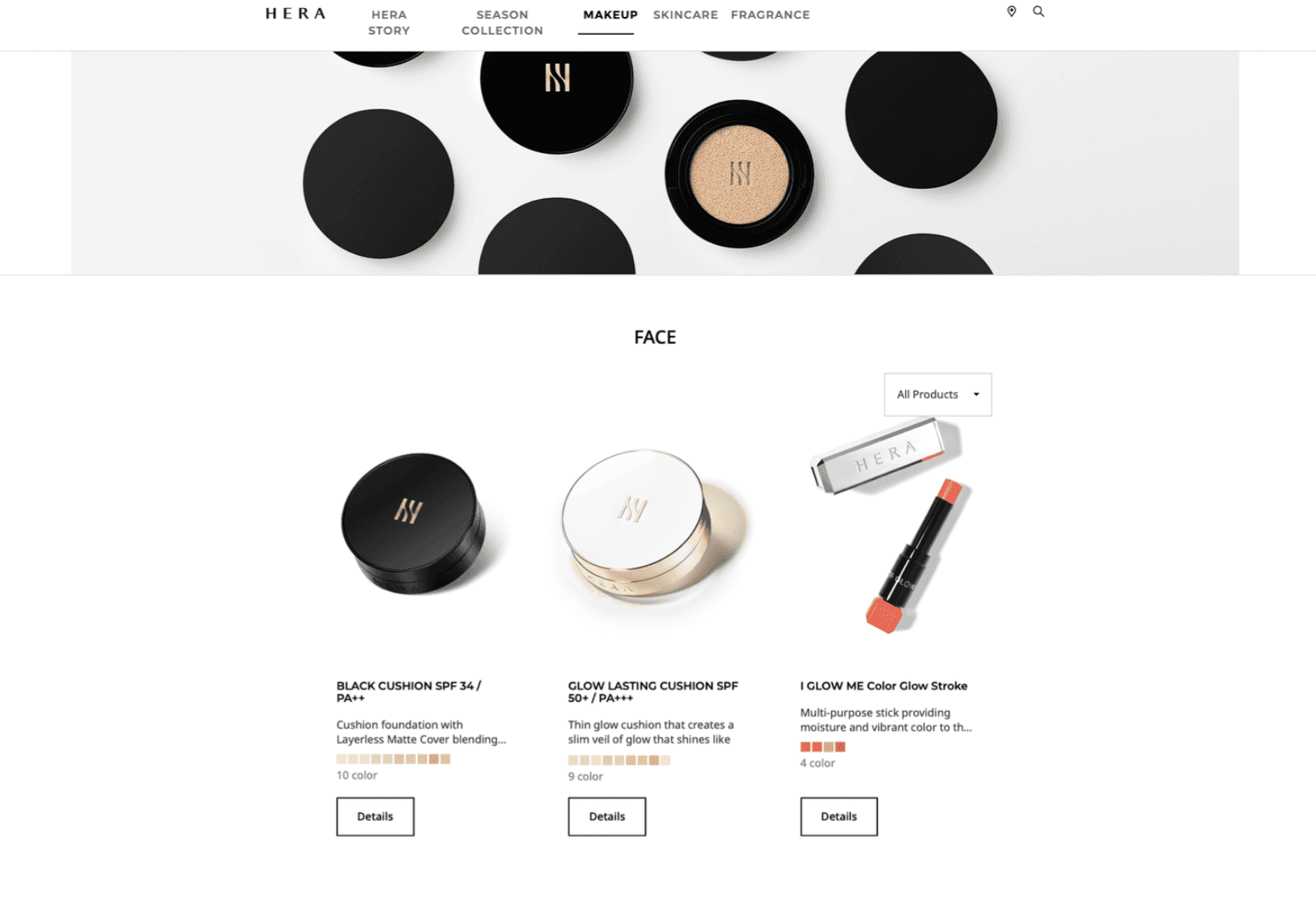
Lack Of Product Displays
The website's focus on models wearing products creates confusion about the specific items being displayed, making it difficult for customers, especially those with limited beauty knowledge, to identify and explore the products they are interested in which negatively affects their browsing experience.
The website's focus on models wearing products creates confusion about the specific items being displayed, making it difficult for customers, especially those with limited beauty knowledge, to identify and explore the products they are interested in which negatively affects their browsing experience.
Click to enlarge image
Click to enlarge image


Inefficient Product Viewing
Inefficient Product Viewing
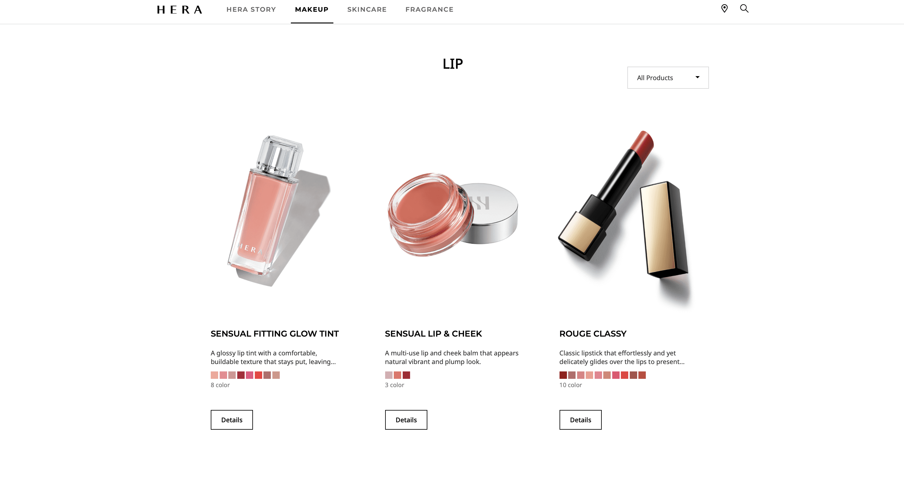
When customers click on an item they are interested in, they are redirected to a new page to view the product. If they decide the item is not suitable, they have to go back to the previous page and scroll past products they have already seen. This inefficient browsing flow can be time-consuming and frustrating for users, leading to a poor user experience.
When customers click on an item they are interested in, they are redirected to a new page to view the product. If they decide the item is not suitable, they have to go back to the previous page and scroll past products they have already seen. This inefficient browsing flow can be time-consuming and frustrating for users, leading to a poor user experience.
Click to enlarge image
Click to enlarge image


Poor Checkout Process
Poor Checkout Process
The website lacks a prominent "add to cart" button, which can create confusion for customers when trying to place an order or add items to their shopping cart. The absence of a clear and easily accessible purchasing option may hinder the conversion rate and frustrate users who want to make a purchase.
The website lacks a prominent "add to cart" button, which can create confusion for customers when trying to place an order or add items to their shopping cart. The absence of a clear and easily accessible purchasing option may hinder the conversion rate and frustrate users who want to make a purchase.
Key Survey Voices
Key Survey Voices
Understanding target user needs
Understanding target user needs


“I do not have a lot of free time, going back and forth between pages to simply look at products was time consuming and quite annoying” — Busy Professional


“As someone who has limited knowledge about beauty, I was confused about what products were being displayed and used” — Limited Knowledge Customer
“As someone who has limited knowledge about beauty, I was confused about what products were being displayed and used” — Limited Knowledge Customer


“I was trying to add products into my cart until I realized there was no add to cart button” — Student
“I was trying to add products into my cart until I realized there was no add to cart button” — Student
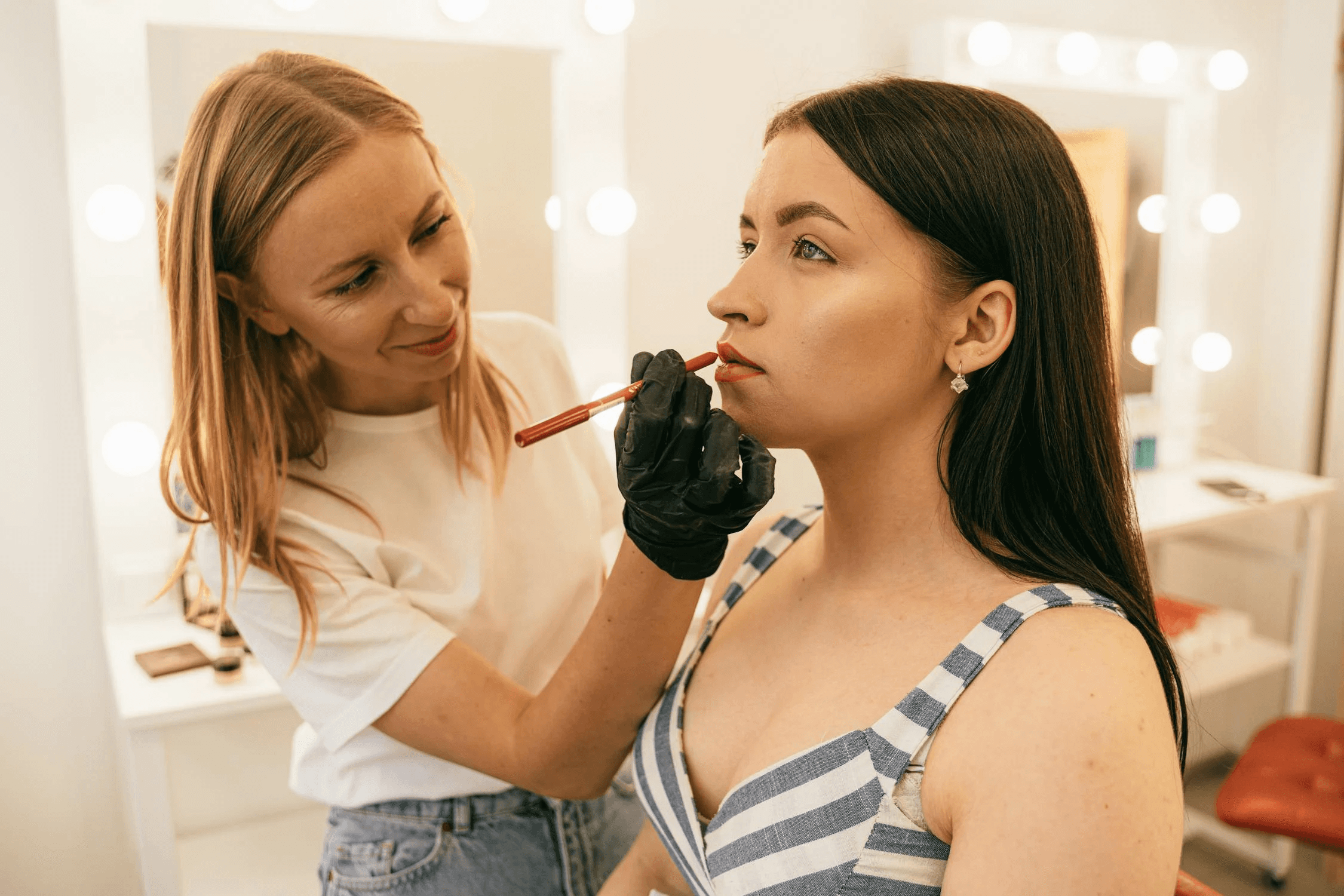


“I could not tell what exact products the models were wearing, so I would rather shop at other stores where the focus is on the product, not the models” — Licensed Makeup Artist
“I could not tell what exact products the models were wearing, so I would rather shop at other stores where the focus is on the product, not the models” — Licensed Makeup Artist
“I do not have a lot of free time, going back and forth between pages to simply look at products was time consuming and quite annoying” — Busy Professional


Ideation
Solutions Brainstorm
Lack Of Product Displays
How can we help all customers understand products while navigating Hera Beauty?
Add clearer product labels for simple identification
Incorporating more images of product usage instead of models
Clear and concise descriptions to prevent overwhelming those with limited knowledge
Inefficient Product Viewing
How can we create a seamless navigation and browsing experience for customers?
Add a "quick view" to let customers gather information without clicking back and forth
Add clearer categorical labels ex: face, lips
Poor Checkout Process
How can customers easily add items to their cart and successfully checkout with ease?
Add a clear “add to cart button” to all available products
Minimize the amount of clicks it takes to fully check out
A brief user flow and ensure users are fully informed of their progress throughout the checkout process
Ideation
Solutions Brainstorm
Problem: Lack Of Product Displays
How can we help customers, even those with minimal knowledge about beauty, easily identify and understand products while navigating Hera Beauty?
Add clearer product labels for simple identification
Incorporating more images of product usage instead of models
Clear and concise descriptions to prevent overwhelming those with limited knowledge
Problem: Inefficient Product Viewing
How can we create a seamless navigation and browsing experience for customers?
Add a "quick view" to let customers gather information without clicking back and forth
Add clearer categorical labels ex: face, lips
Problem: Poor Checkout Process
How can customers easily add items to their cart and successfully checkout with ease?
Add a clear “add to cart button” to all available products
Minimize the amount of clicks it takes to fully check out
A brief user flow and ensure users are fully informed of their progress throughout the checkout process
Checkout Research
Checkout Research
Streamlining the checkout experience
Streamlining the checkout experience
Although Hera Beauty products can be purchased in the United States through third-party websites, they can only be directly purchased on their website in Korea which is not clearly communicated to customers, resulting in a confusing user experience.
Although Hera Beauty products can be purchased in the United States through third-party websites, they can only be directly purchased on their website in Korea which is not clearly communicated to customers, resulting in a confusing user experience.


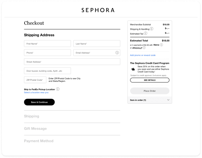
Sephora
Pros
Single screen
Minimalistic
Black & white (not overwhelming)
Cons
No coupon section in the flow
Olive Young
Pros
Single Screen
Simple colors
Can easily tell required information
Cons
Overwhelming amount of text
Amazon
Pros
Single Screen
Highlighting important information
Cons
Overwhelming amount of text
Multiple colors (yellow, red, green, blue) results in an overwhelming experience
Competitive Analysis
Competitive Analysis
Competitors like Sephora, Amazon, and Olive Young use a single-page checkout, clearly displaying the required sections, which creates a transparent and seamless experience for customers.
Competitors like Sephora, Amazon, and Olive Young use a single-page checkout, clearly displaying the required sections, which creates a transparent and seamless experience for customers.
Competitor checkout pros and cons
Sephora
Pros
Single screen
Minimalistic
Black & white (not overwhelming)
Cons
No coupon section in the flow
Amazon
Pros
Single Screen
Highlighting important information
Cons
Overwhelming amount of text
Multiple colors (yellow, red, green, blue) results in an overwhelming experience
Olive Young
Pros
Single Screen
Simple colors
Can easily tell required information
Cons
Overwhelming amount of text
User Flow
User Flow
I designed a checkoutuser flow inspired by the successful single-page checkout processes of industry leaders like Sephora, Amazon, and Olive Young
I designed a checkoutuser flow inspired by the successful single-page checkout processes of industry leaders like Sephora, Amazon, and Olive Young
Key
Key
Key


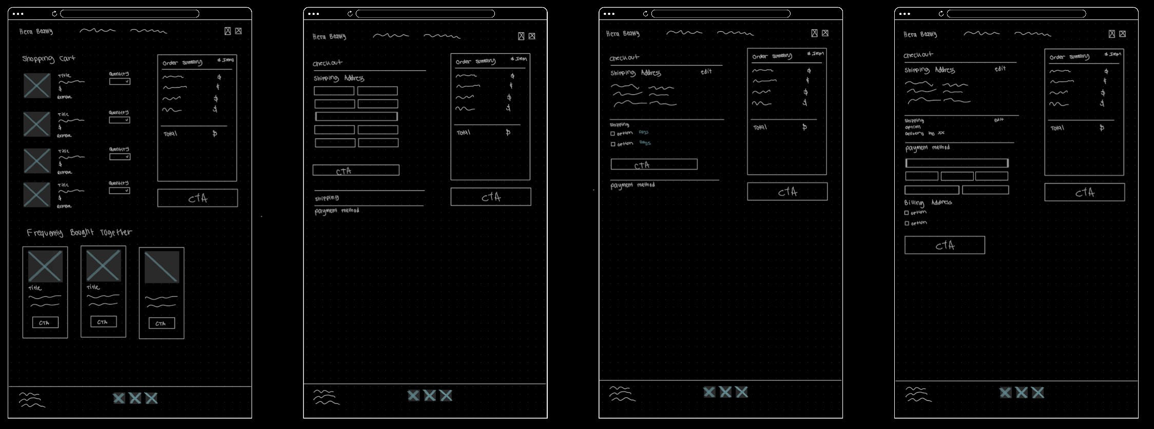
Ideation Sketches and Wireframes
Ideation Sketches and Wireframes
Landing, product, and checkout pages
Landing, product, and checkout pages


Landing Page
Landing Page
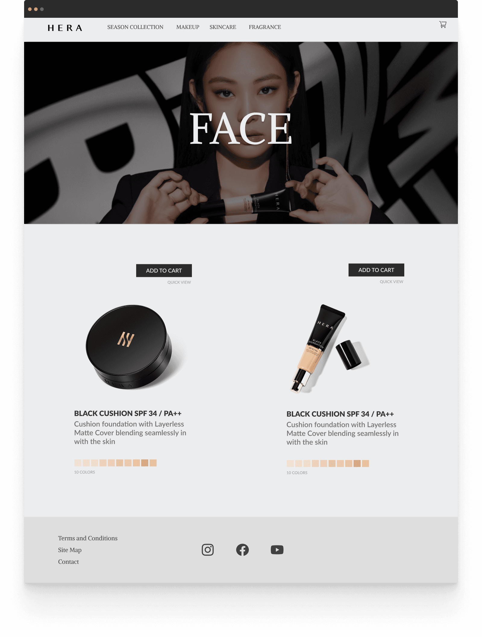
For the landing page, I aimed to spotlight the products and emphasize their usage by designing a minimalistic layout that places primary marketing focus on them.
For the landing page, I aimed to spotlight the products and emphasize their usage by designing a minimalistic layout that places primary marketing focus on them.
Product Page
Product Page
I enlarged the category titles to enhance visibility and ensure customers immediately know the type of product they are viewing. By highlighting two products at a time, this prevents customers from feeling overwhelmed during the browsing experiences especially those with less knowledge about beauty.
I enlarged the category titles to enhance visibility and ensure customers immediately know the type of product they are viewing. By highlighting two products at a time, this prevents customers from feeling overwhelmed during the browsing experiences especially those with less knowledge about beauty.


Checkout page
Checkout page
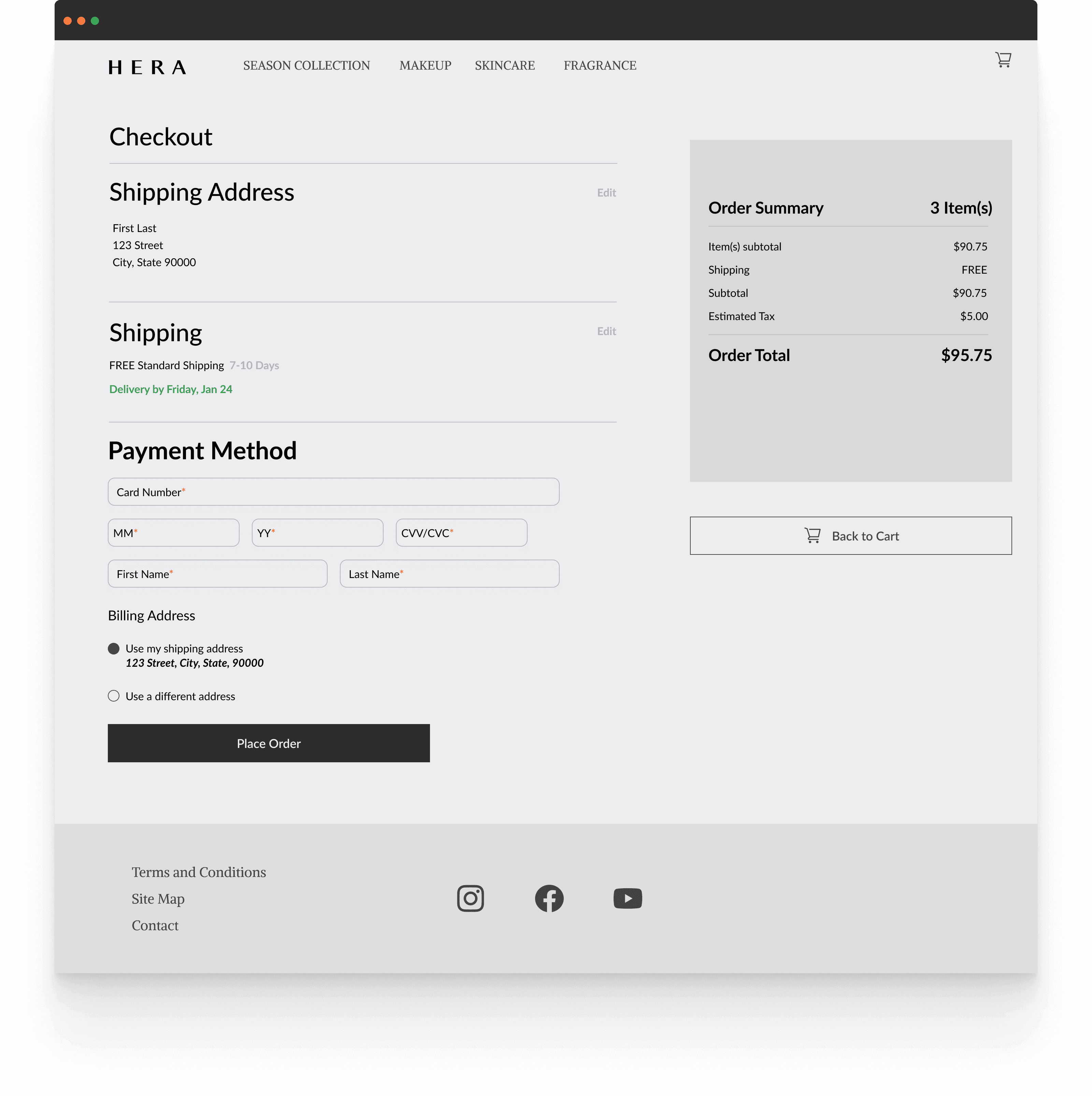
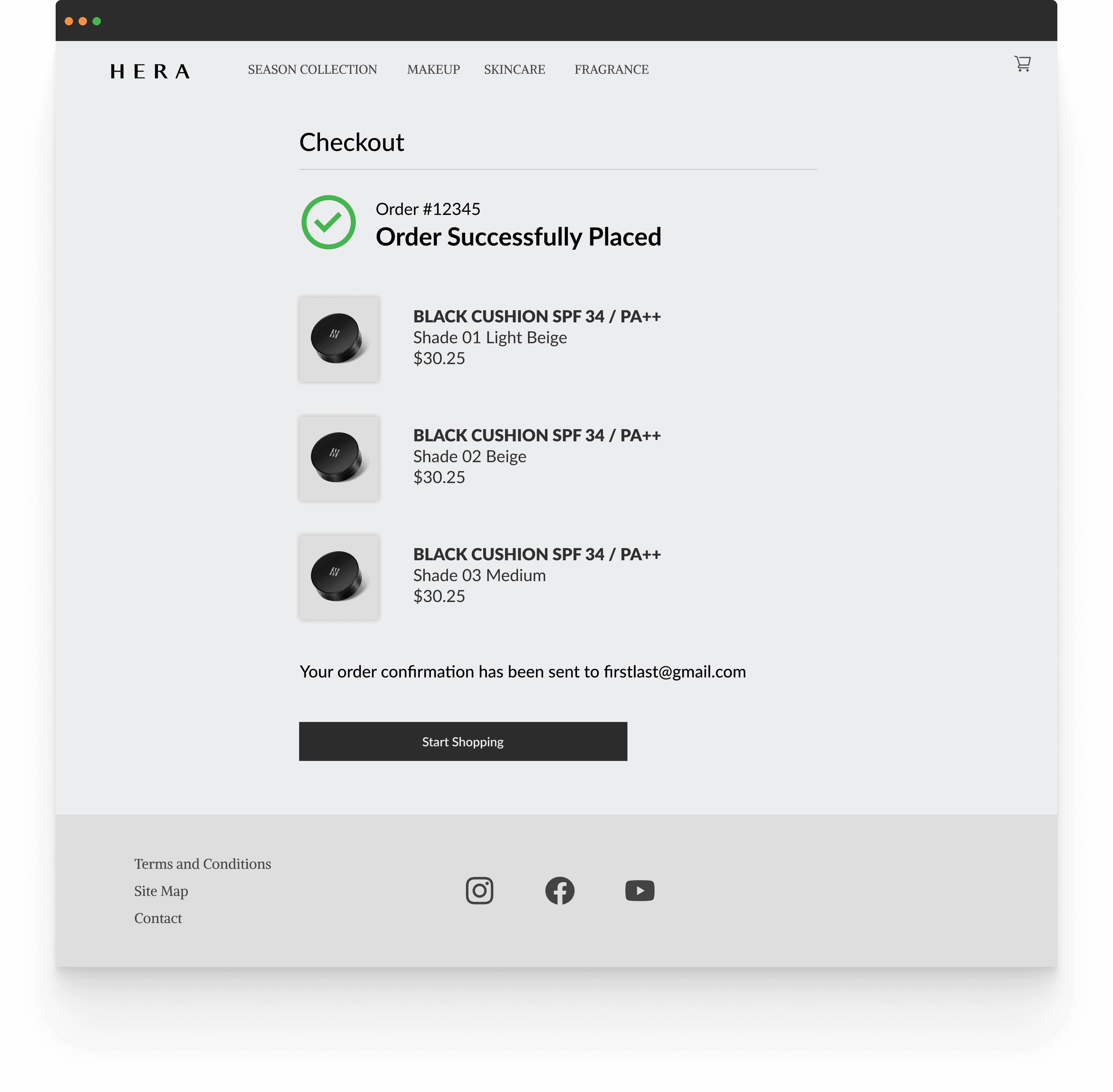
Similar to top competitors, I implemented a single-page checkout process to ensure transparency and provide a seamless user experience, allowing customers to easily track their progress through the checkout stages.
Similar to top competitors, I implemented a single-page checkout process to ensure transparency and provide a seamless user experience, allowing customers to easily track their progress through the checkout stages.


Solutions To Problems
Solutions To Problems
Designing data driven solutions
Designing data driven solutions


Solution
Solution
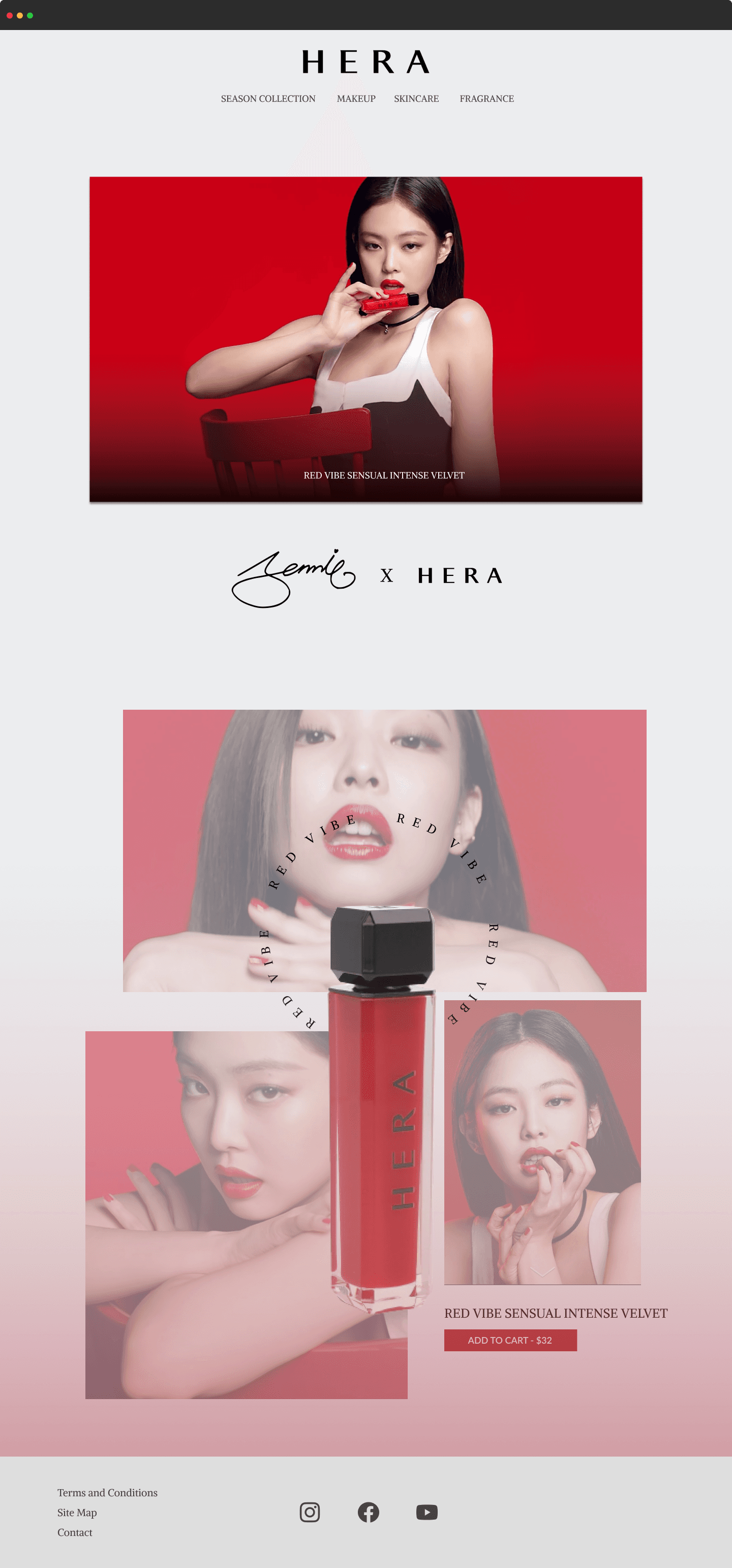
Created a homepage that displays the physical products to highlight the products and place the primary marketing focus on them and their usage. Added labels to models to minimize confusion about which product is being displayed.
Created a homepage that displays the physical products to highlight the products and place the primary marketing focus on them and their usage. Added labels to models to minimize confusion about which product is being displayed.


Solution
Solution
I added a "quick view" button tool for customers to have a quick and easily accessible way to view the product they are interested in without having to be sent to a new page. Bolder label for shopping category for easy identification.
I added a "quick view" button tool for customers to have a quick and easily accessible way to view the product they are interested in without having to be sent to a new page. Bolder label for shopping category for easy identification.



Solution
Solution
Added an accessible "add to cart" button. By using a dark colored button to contrast the lighter background, the high-contrast button provides visibility to where to add an item to their cart, further reducing problems during their shopping experience.
Added an accessible "add to cart" button. By using a dark colored button to contrast the lighter background, the high-contrast button provides visibility to where to add an item to their cart, further reducing problems during their shopping experience.


Solution
Solution
My checkout page design uses a black-and-white color scheme with minimal colors for emphasis to ensure customers are not overwhelmed with information and excessive colors. The single-page checkout process ensures a seamless user experience that allows customers to easily track their progress.
My checkout page design uses a black-and-white color scheme with minimal colors for emphasis to ensure customers are not overwhelmed with information and excessive colors. The single-page checkout process ensures a seamless user experience that allows customers to easily track their progress.


Usability Testing Redesign
Usability Testing Redesign
Ensuring positive results
Ensuring positive results


Was the presentation of the product and its intended usage clearly conveyed?
Was the presentation of the product and its intended usage clearly conveyed?
12 out of 12 users found the presentation and usage of the products to be clear
12 out of 12 users found the presentation and usage of the products to be clear



Did you manage to complete the check out process successfully?
Did you manage to complete the check out process successfully?
12 out of 12 users were able to successfully check out
12 out of 12 users were able to successfully check out


What issues, if any, did you encounter during your experience?
What issues, if any, did you encounter during your experience?
12 out of 12 users reported no issues
12 out of 12 users reported no issues
Design Concepts
Design Concepts
Promotional product designs
Promotional product designs




Conclusion
Conclusion
What I learned
What I learned
1) Adaptability. Executing a comprehensive design process enabled me to gain diverse experiences and take on multiple roles.
1) Adaptability. Executing a comprehensive design process enabled me to gain diverse experiences and take on multiple roles.
2) Conducting UX research. I learned how to create and conduct usability tests, uncovering valuable insights and pain points about user experiences, and researching competitors to ensure data-driven solutions.
2) Conducting UX research. I learned how to create and conduct usability tests, uncovering valuable insights and pain points about user experiences, and researching competitors to ensure data-driven solutions.

