10 weeks
3 UX Designers
5 Developers
Figma
ACM projects is a quarterly long project program for students to get exposed to AI, software engineering, and design, and the projects website’s goal is to inform students about the program and its requirements. My task was to design multiple cross-platform website pages to encourage more students to sign up for the program while having an engaging and informative experience.
Designing the ACM projects website was a challenge due to the newly elected Projects VP's revamp of the program which resulted in conflicting wants and needs from our previous stakeholder.
The lack of a clear structural vision from the new VP resulted in our ideas and designs pivoting mid way. I must now develop and conceptualize cohesive designs that align with the evolving needs of the projects program within a constrained timeframe of 10 weeks.


Conducted usability testing with 10 students to assess the current website's effectiveness in communicating information and encouraging sign-ups.
Ages 18-21
Limited Knowledge
UCSD Students
Key Voices

New Design Student
"The purpose of projects is to get creative, but the website is quite underwhelming in that aspect. Doesn’t inspire me to apply."

Freshman at UCSD
"It an overwhelming amount of information"

Software Engineer Student
"I wish there were more resources to learn more about these fields, especially if I am unable to be a participant."
0 out of 10 students would apply to the program after exploring the current website.
Key Reasons
Lack of incentives
Confused about the program's benefits
10 out of 10 students found the website visually unappealing and experienced navigation problems.
Key Reasons
Lack of visual appeal
Poor text hierarchy
Text-heavy
6 out of 10 students stated that they were new to at least one of these fields.
Key Reasons
New students
Trying to learn and break into these fields
A sample size of 10 individuals is small, which could result in misleading and non-representative data. We wanted to ensure our findings are accurate and representative and with the help of AI heat maps, we were able to see what elements students were exploring and not viewing. The heat map indicates that dense blocks of text were not viewed, aligning with actual user behavior and our usability tests.


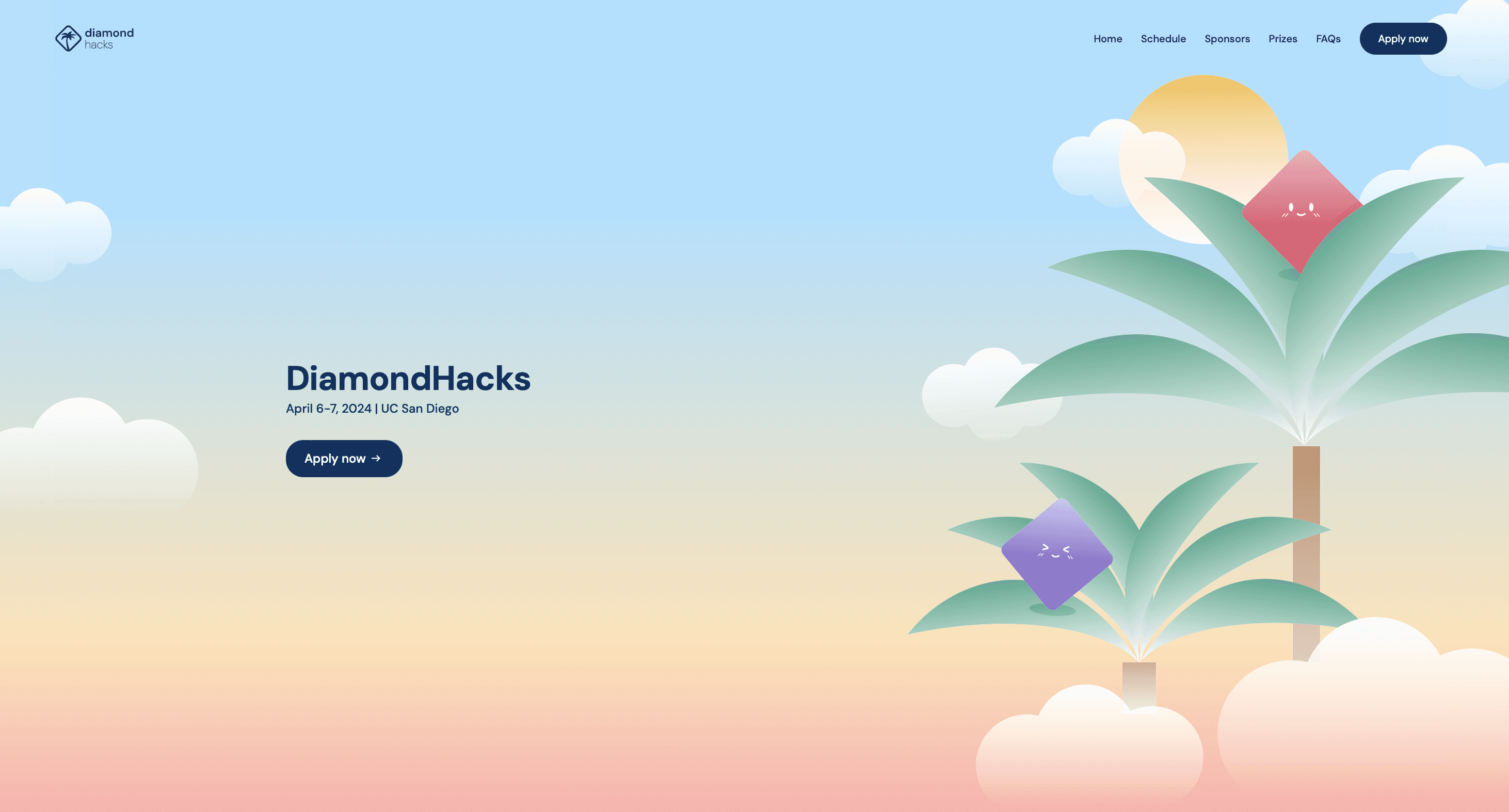
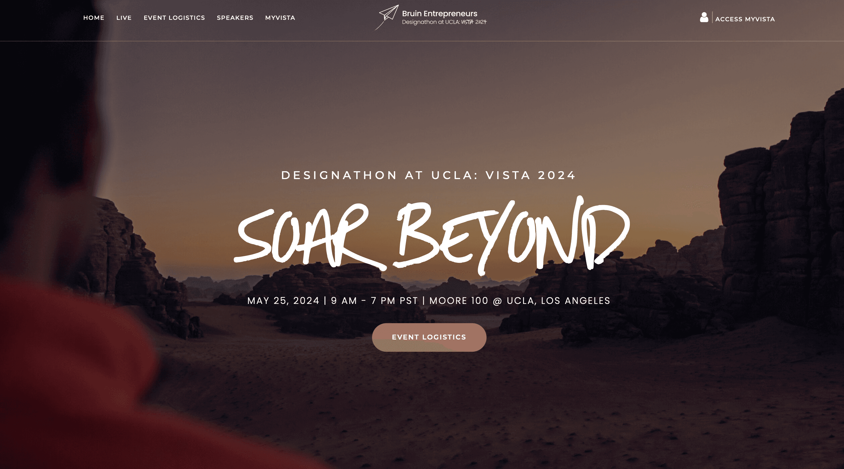
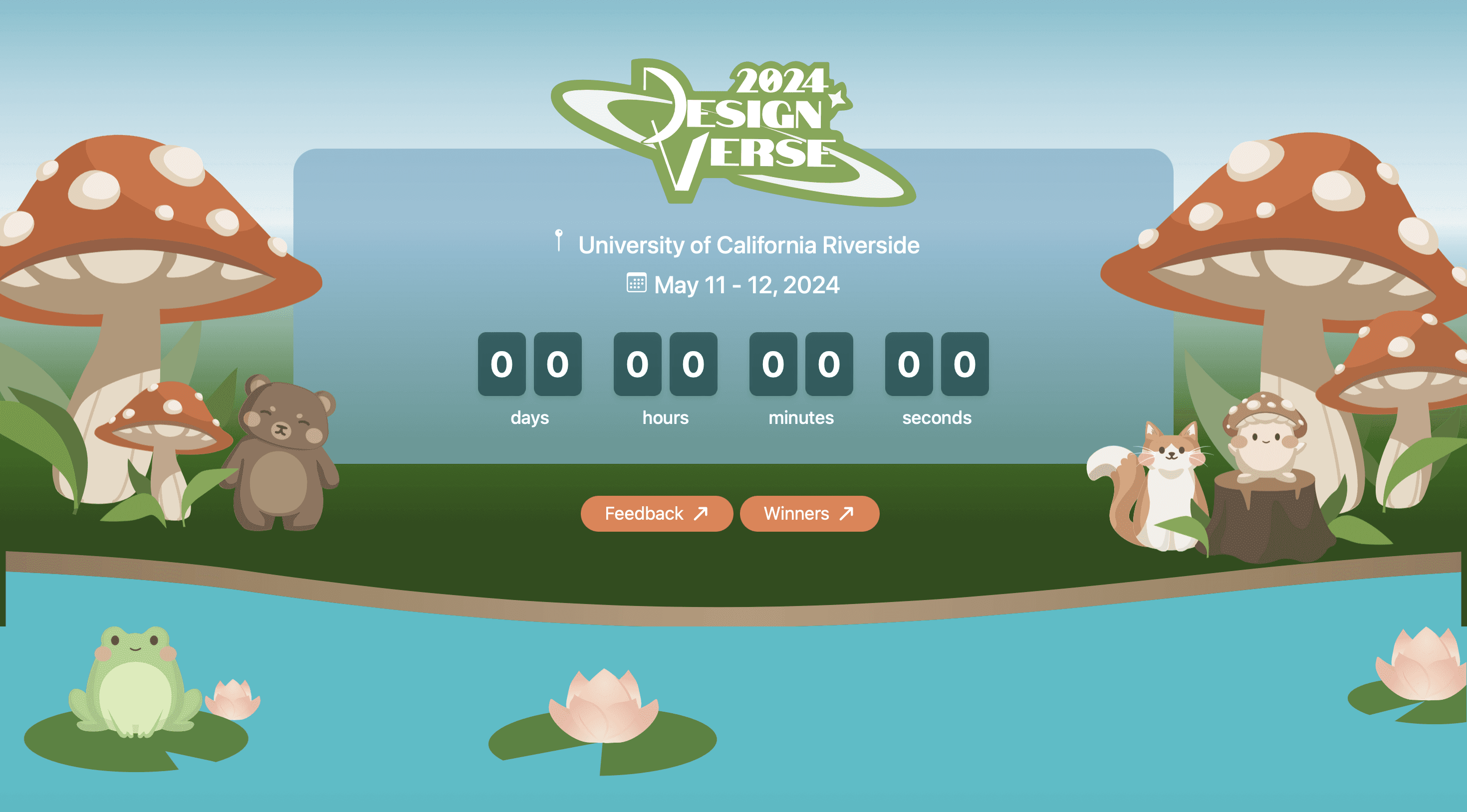
When asked how students gain exposure to new projects and technologies, students expressed that they often participate in popular hack and designations. By understanding user preferences and analyzing competitors' strengths and weaknesses, we are able to create strategic design solutions.


As a UX/UI designer, I ideated and executed designs that satisfied stakeholder needs and expectations, while collaborating with developers to ensure feasibility. This involved facilitating weekly meetings and maintaining open communication to gather and implement design feedback and satisfaction.
Sudden changes in stakeholders and expectations required me to quickly adapt and ideate and implement new designs, ensuring alignment with evolving needs.
I ensured all my design elements including frames, components, and variables are all organized and ready for development.